Lecture 5
Distribution Comparison
A common problem is determining whether two distributions of two samples are the same. While statistical tests can help answer this question, visualization techniques are also quite effective. Many of the plots we have seen can be adapted to compare distributions from independent samples.
One way to do so is to create two stem-and-leaf plots back-to-back, sharing common stems but having leaves from different data sets extending out in different directions. Base R will not do this, but the stem.leaf.backback() function in the aplpack package can create such a chart. stem.leaf.backback(x, y) will plot the distributions of the data in vectors x and y with a back-to-back stem-and-leaf plot. Here we use this function to examine the distribution of tooth lengths of guinea pigs given different supplements, contained in the ToothGrowth data set.
# library(aplpack)
str(ToothGrowth)
## 'data.frame': 60 obs. of 3 variables:
## $ len : num 4.2 11.5 7.3 5.8 6.4 10 11.2 11.2 5.2 7 ...
## $ supp: Factor w/ 2 levels "OJ","VC": 2 2 2 2 2 2 2 2 2 2 ...
## $ dose: num 0.5 0.5 0.5 0.5 0.5 0.5 0.5 0.5 0.5 0.5 ...# The split function can split data vectors depending on a factor. Here,
# split will split len in ToothGrowth depending on the factor variable supp,
# creating a list with the two variables we want
len_split <- with(ToothGrowth, split(len, supp))
OJ <- len_split$OJ
VC <- len_split$VC
# stem.leaf.backback(OJ, VC, rule.line = 'Sturges')We have seen comparative boxplots before; again, they can be quite useful for comparing distributions. Calling boxplot(x, y) with two data vectors x and y will compare the distributions of the data in the vectors x and y with a comparative boxplot.
boxplot(OJ, VC)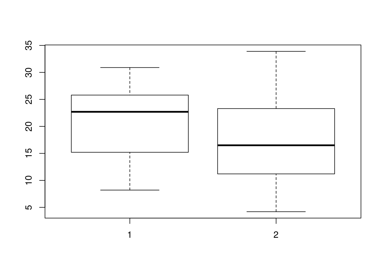
We can also use density estimates to compare distributions, like so:
plot(density(OJ), lty = 1)
lines(density(VC), lty = 2)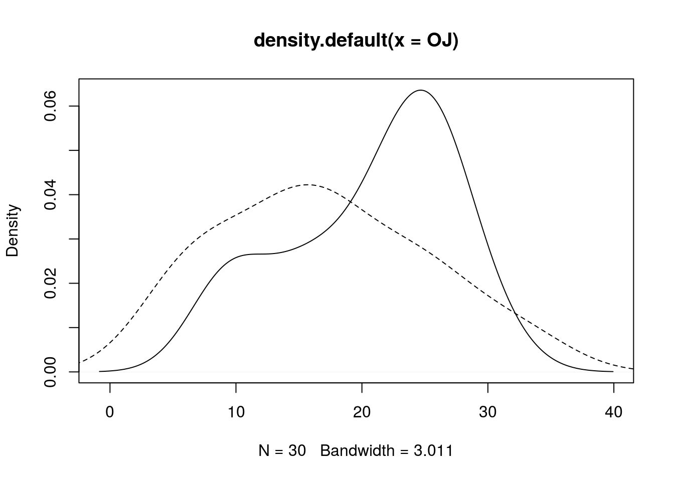
Model Formula Interface
You have seen this interface before, and now we discuss it in more detail. The interface is y ~ x, or more descriptively, response ~ predictor. Loosely, we see the response variable as being dependent on the predictor, which could by a single variable, as in y ~ x, or a combination of variables, as in y ~ x + z. (+ is overloaded to have a special meaning in the model formula interface, and thus does not necessarily mean “addition”. If you wish to have + mean literal “addition”, use the function I(), as in y ~ I(x + z).) Many function in R use the formula interface, and often include additional arguments such as data (for specifying a data frame containing the data and variables described by the formula) and subset (used for selecting a subset of the data, according to some logical rule). Functions that use this formula interface include boxplot(), lm(), summary(), and lattice plotting functions.
Below I demonstrate using boxplot()’s formula interface for exploring the ToothGrowth data more simply.
# Here, I plot the tooth growth data depending on supplement when dose ==
# 0.5
boxplot(len ~ supp, data = ToothGrowth, subset = dose == 0.5)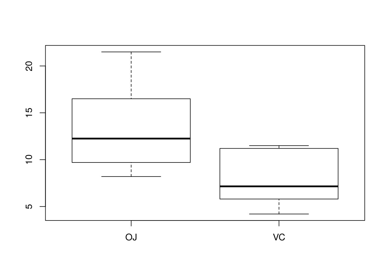
# I can create a boxplot that depends on both supplement and dosage
boxplot(len ~ supp + dose, data = ToothGrowth)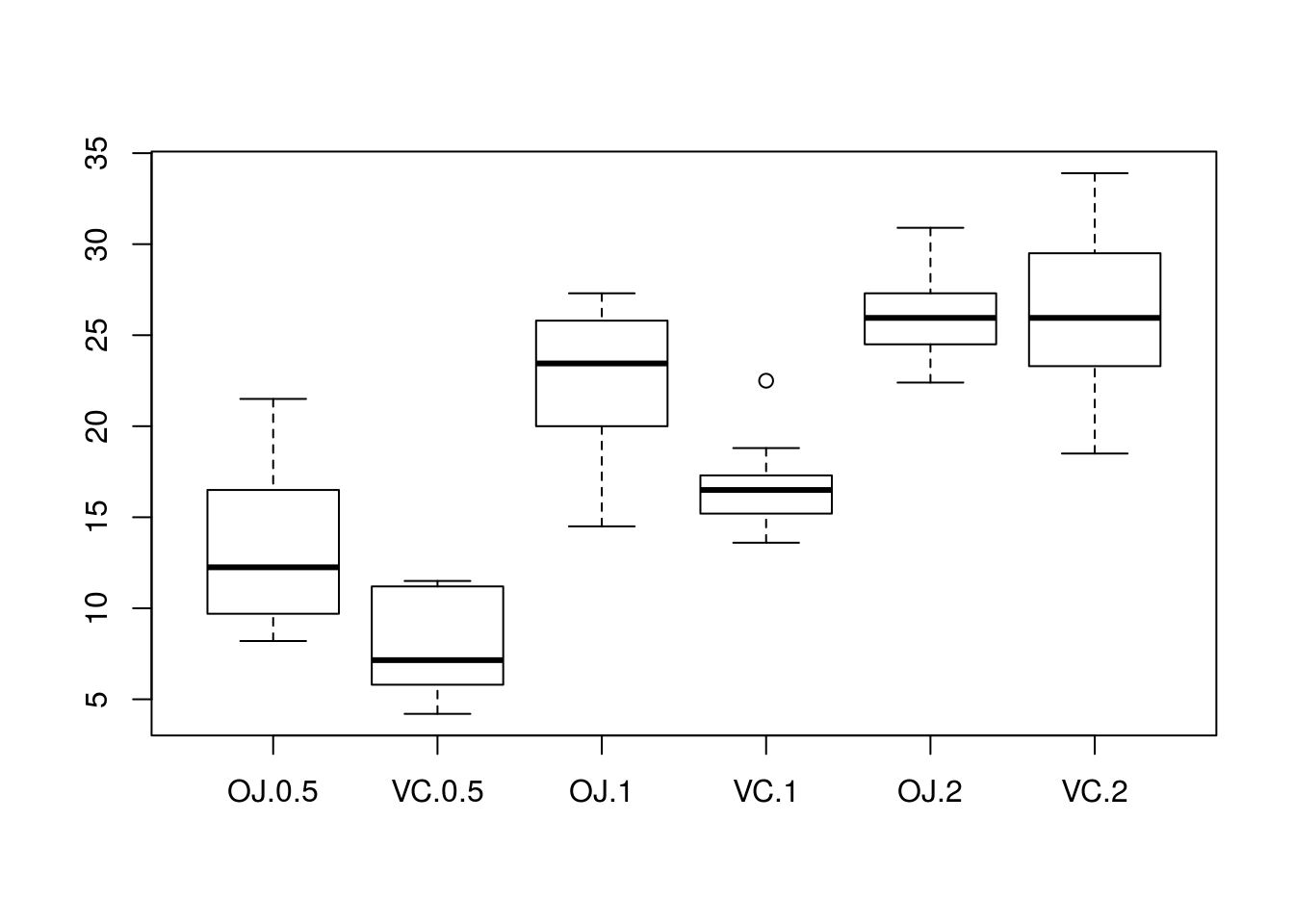
Here I compare means of tooth lengths using the formula interface in summary(), provided in the package Hmisc.
library(Hmisc)## Loading required package: lattice## Loading required package: survival## Loading required package: Formula## Loading required package: ggplot2##
## Attaching package: 'Hmisc'## The following objects are masked from 'package:base':
##
## format.pval, units# First, the result of summary
summary(len ~ supp + dose, data = ToothGrowth)## len N= 60
##
## +-------+---+--+--------+
## | | |N |len |
## +-------+---+--+--------+
## |supp |OJ |30|20.66333|
## | |VC |30|16.96333|
## +-------+---+--+--------+
## |dose |0.5|20|10.60500|
## | |1 |20|19.73500|
## | |2 |20|26.10000|
## +-------+---+--+--------+
## |Overall| |60|18.81333|
## +-------+---+--+--------+# A nice plot of this information (though the table is very informative; a
# plot may not be necessary)
plot(summary(len ~ supp + dose, data = ToothGrowth))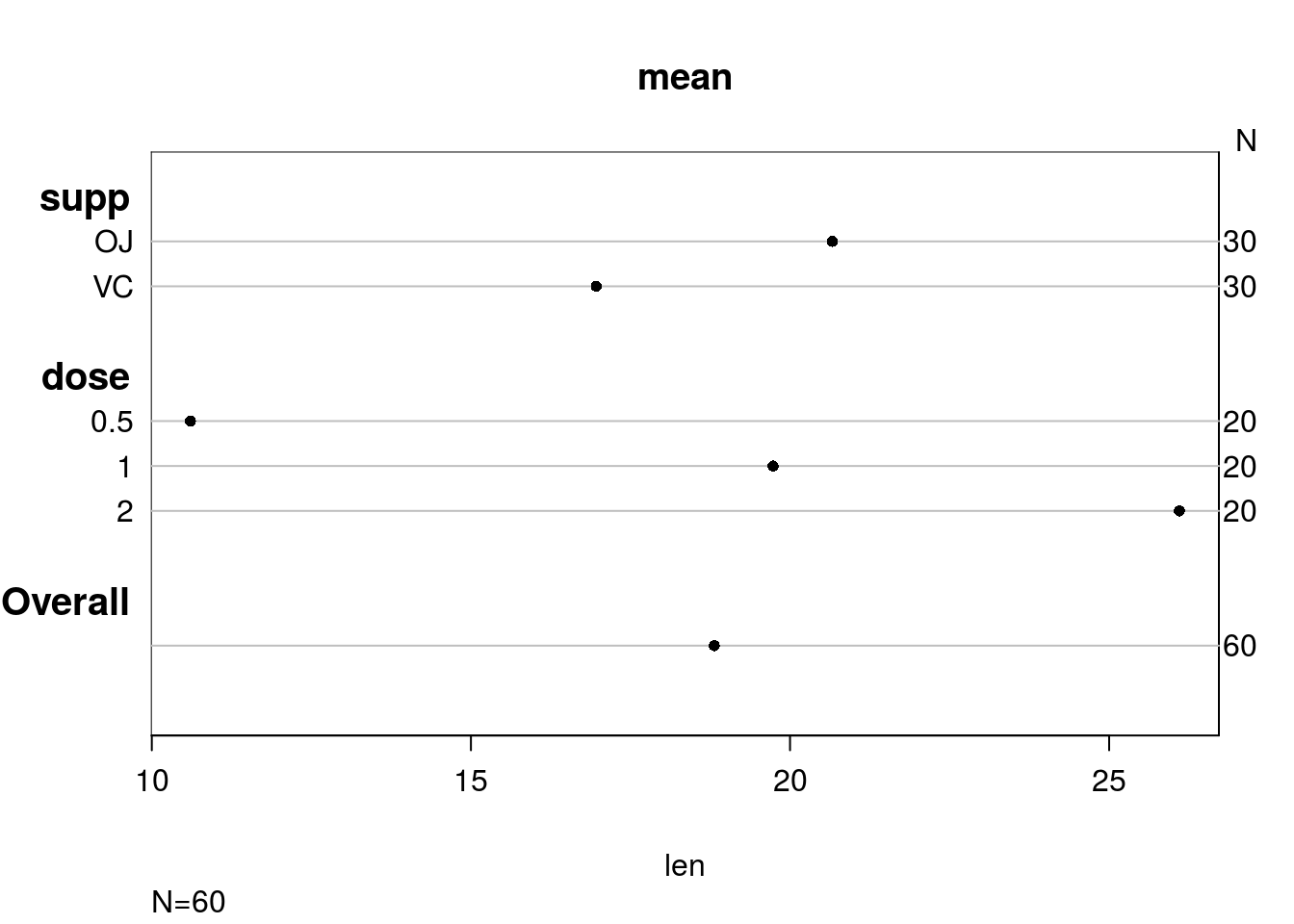
Paired Data
So far we have examined data that came from two independent samples. They may measure the same thing, but they should still be regarded as distinct. Paired data is an entirely separate case. With paired data, two variables were recorded for one observation. Usually we want to know what the relationship between the two variables is, if any.
A good first step to studying paired data (in fact, you should consider it a necessary step!) is to visualize the relationship between the variables with a scatterplot. You could do so with plot(y ~ x, data = d), where x is the variable plotted along the horizontal axis of a scatterplot, y the variable plotted along the vertical axis, and d the data set containing x and y (if applicable).
The data set fatcontains various measurements from people’s bodies. Let’s examine the relationship between height and weight with a scatterplot.
library(UsingR)## Loading required package: MASS## Loading required package: HistData##
## Attaching package: 'UsingR'## The following object is masked from 'package:survival':
##
## cancerplot(weight ~ height, data = fat)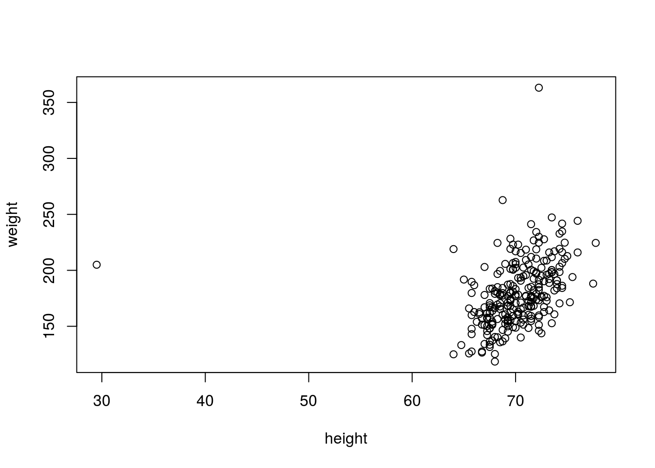
# Using a scatterplot, we immediately identified an outlier, an individual
# that, while not necessarily having an unusual weight, is much shorter than
# usual (probably an individual with dwarfism). There is also an individual
# who is unusually heavy, though having a typical height. We filter out
# those poiints in another plot
plot(weight ~ height, data = fat, subset = height > 60 & weight < 300)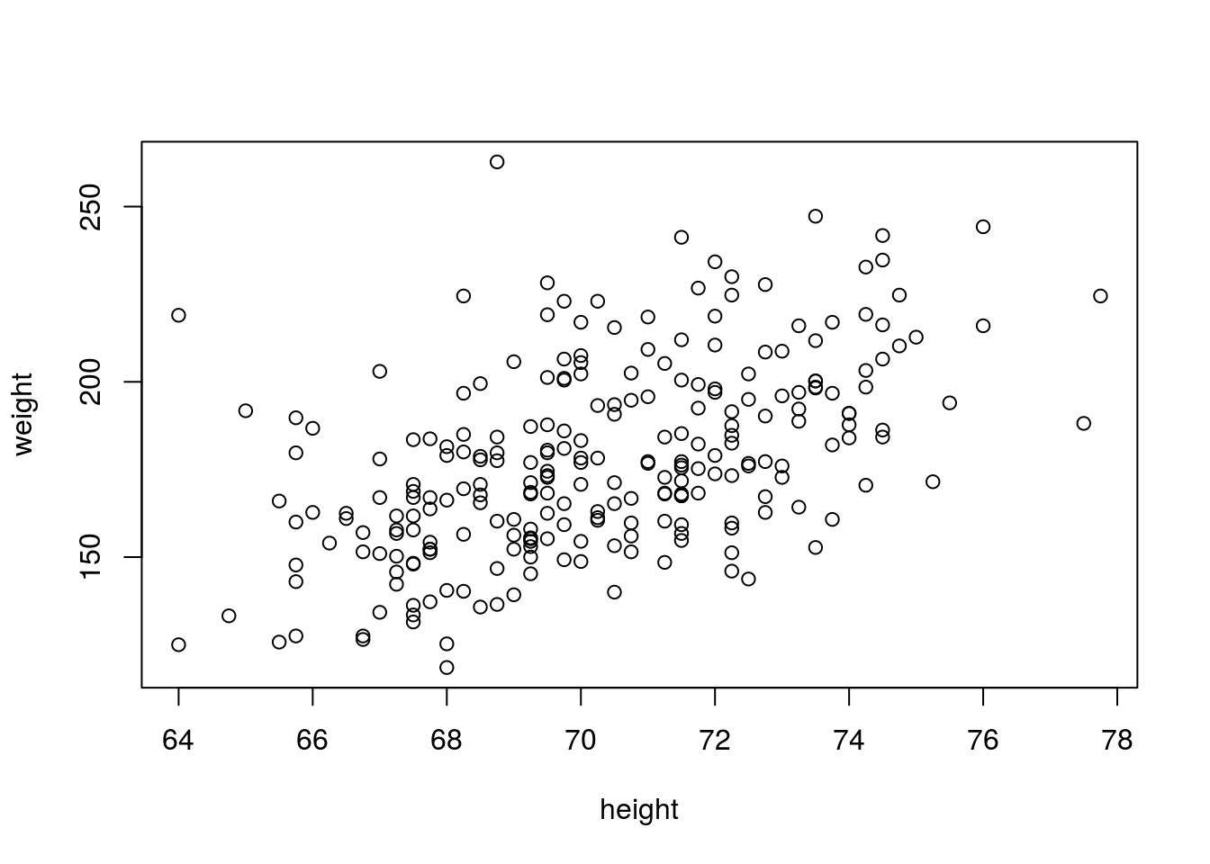
It’s a good idea to plot data before numerically analyzing it. Outliers and non-linear relationships between variables are often easy to identify graphically, but can hide in numeric summaries.
Correlation
The correlation between two variables measures the strength of their relationship. Without discussing how correlation is computed, let \(r\) represent the correlation between two variables. It is always true that \(-1 \leq r \leq 1\). If \(r = 0\), there is no linear relationship between the variables (there may still be a relationship, just not a linear one). If \(|r| = 1\), there is a perfect linear relationship between the variables; if plotted in a scatterplot, the variables would fall along a perfectly straight line. \(\text{sign}(r)\) indicates the direction of the relationship. If \(r > 0\), there is a positive relationship between the variables; as one variable increases, the other also tends to increase. If \(r < 0\), there is a negative relationship between the variables; as one variable increases, the other tends to decrease.
No real-world data set has a correlation that is perfectly zero, one, or negative one (unless engineered). A rule of thumb is that if \(0 \leq |r| < .3\), there is no correlation. If \(.3 \leq |r| < .7\), the correlation is weak. If \(|r| \geq .7\), the correlation is strong.
Some illustrations of different correlations follow.
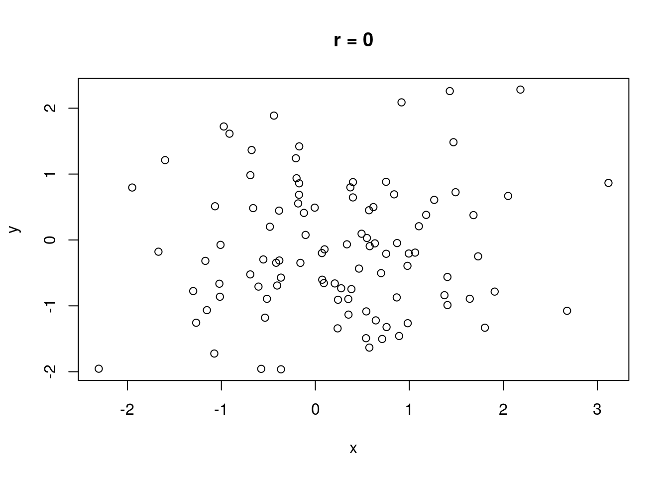
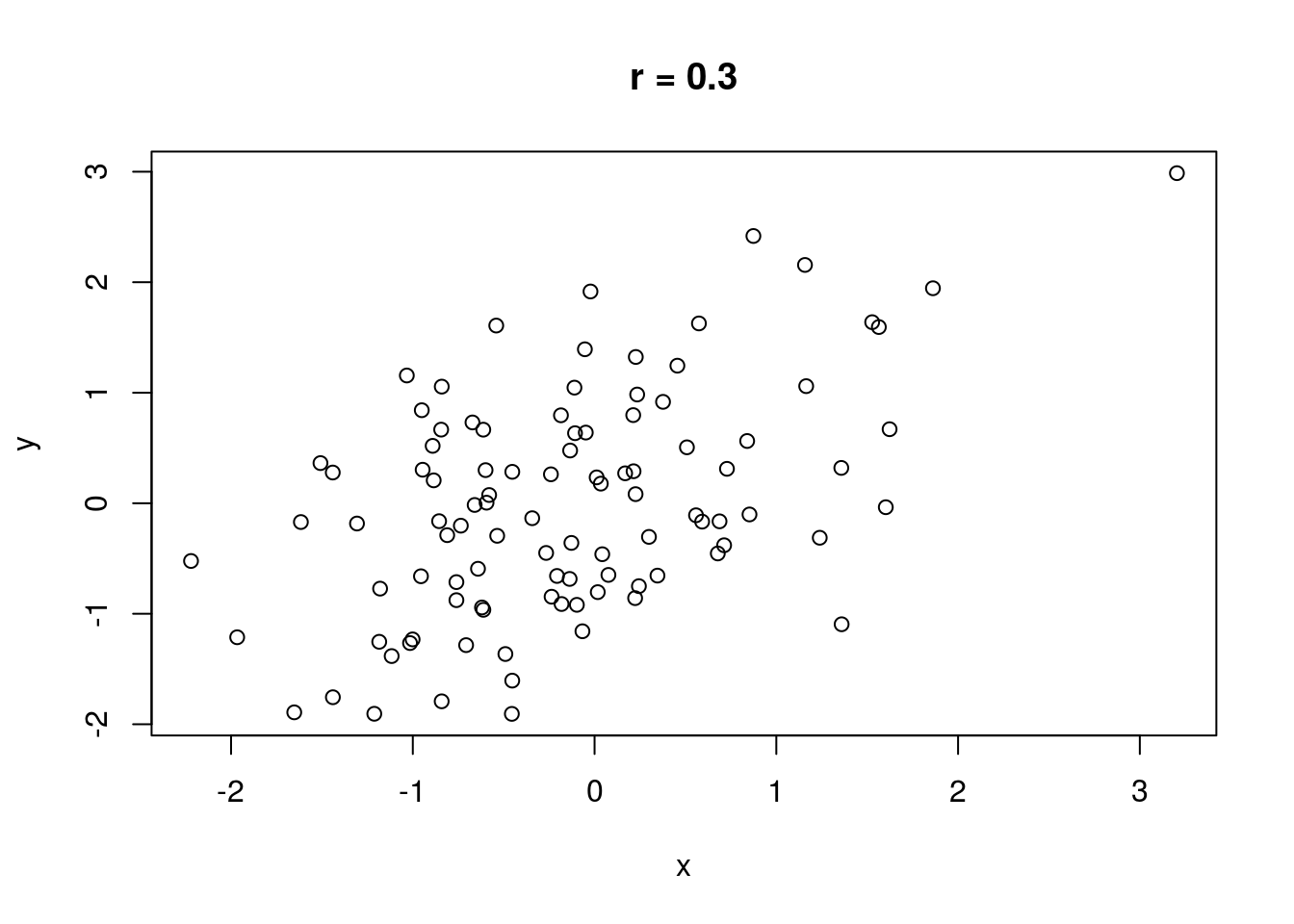
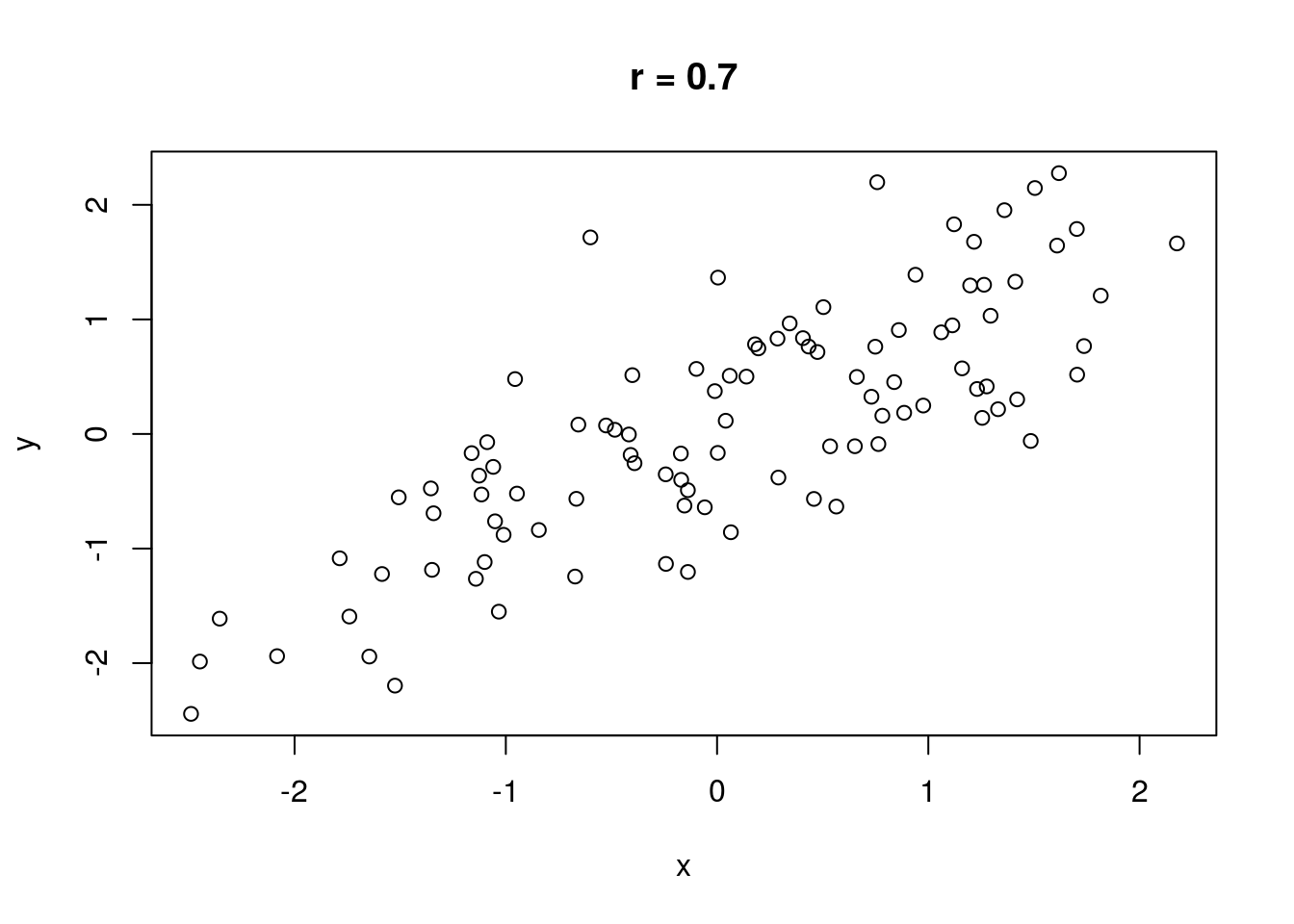
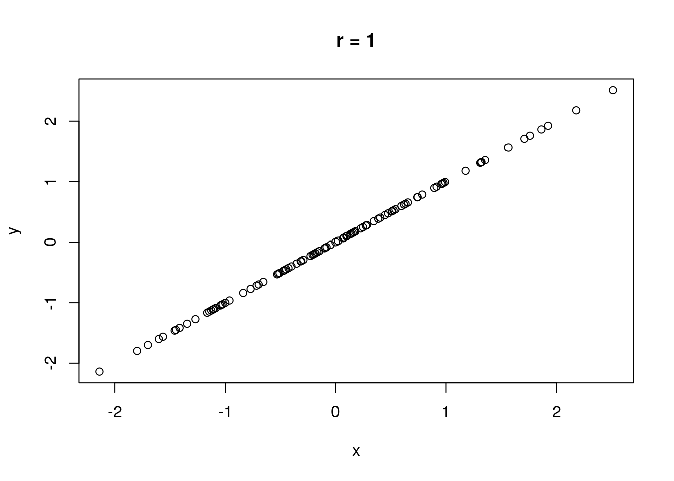
Let’s compute a correlation. The cor() function will compute correlation for a data set, taking two data vectors cor(x, y) and computing the correlation between x and y.
# The correlation of height and weight
cor(fat$height, fat$weight)
## [1] 0.3082785Remember, we are computing linear correlation! There could be a linear correlation of 0, but a perfect non-linear correlation!
x <- (-10):10
y <- x^2
plot(x, y)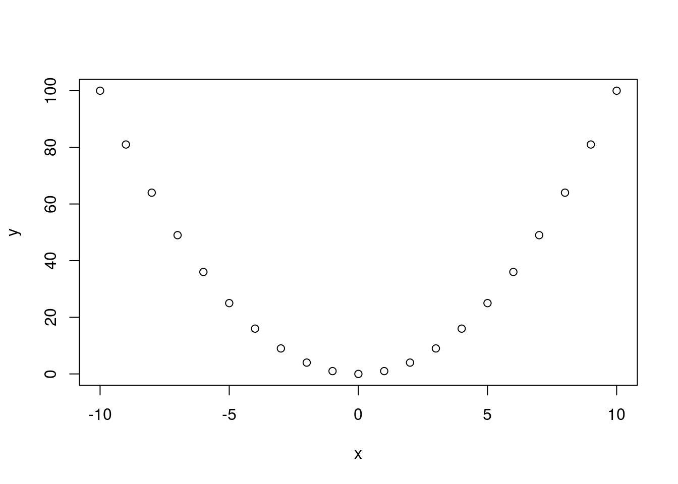
cor(x, y)## [1] 0One thing a researcher must always bear in mind when studying the correlation between variables is that correlation is not causation! A causal relationship between the two variables in study may be responsible for the correlation, but so could a causal relationship between each individual variable and a third, unobserved variable (what we term a latent variable), a causal relationship running in the opposite direction of the one observed (\(y\) causes \(x\) rather than \(x\) causing \(y\)), or a complex confounding relationship involving feedback loops between the variables observed and unobserved latent variables (\(x\) causes \(y\), which in turn causes \(x\), while also being caused by unobserved \(z\) while also causing \(z\)). Additionally, if there is a time component, a correlation between two variables may be strong for no reason other than both variables trend (this may translate simply into time being a latent, unaccounted-for variable, and both variables need to be detrended).
The website Spurious correlations contains many strong correlations that clearly are not causal (though they are quite amusing). How do people discover these? The best explanation may be that when a very large number of variables are observed, correlations will appear. Think of it this way: if every pair of variables in a data set, generated independently, have a probability \(\epsilon(n)\) of producing data sets that are not correlated for data sets of size \(n\), the probability that no correlations appear is roughly \(\left(\epsilon(n)\right)^{{k \choose 2}}\) (keep in mind that \({k \choose 2}\) grows very quickly in \(k\)). This number is approaching zero very fast, so it’s highly unlikely that no correlations at all will appear in the data set. The situation is not hopeless, of course; increasing the sample size \(n\) will increase \(\epsilon(n)\) and make observing misleading sample correlations less likely. But the point remains; it’s easier to find some correlation in data sets that track lots of variables than in data sets that track only a handful, given the same sample size.
As an example, I generated a small data set using random variables I know are not correlated, yet the plot demonstrates that sample correlations still manage to appear, even large ones.
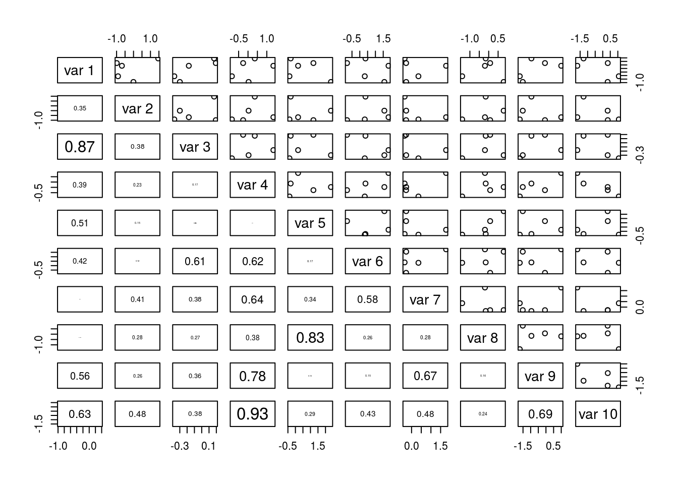
In general, identifying causality between variables is not easy. There are methods for doing so (they are outside the scope of this course), but bear in mind that they usually must inject additional knowledge, be it about the experiment and data collection method or subject matter knowledge, in order to identify causality. Mathematics alone is not sufficient, and no single statistical analysis may have the final say on a subject. It may take numerous replications and permutations of methodology along with clever argument and domain area knowledge to establish a causal link.
Trend Lines
A trend line is a “best fit” line passing through data in a data set that shows what linear relationship between data tends to prevail throughout the data set. Without going into detail about how this line is computed, the trend line typically computed minimizes the squared (vertical) distance of each data point to the line (this distance being called the residual or error).
We investigate here lines of the form \(\hat{y_i} = \beta_0 + \beta_1 x_i\), where \(\hat{y_i}\) is the value of the \(y\) variable predicted by the trend line for the value \(x_i\). \(\beta_0\) is the \(y\)-intercept of the trend line, and \(\beta_1\) the slope of the trend line. We can compute the coefficients of the trend line using the R function lm(y ~ x, data = d), where y is the variable being predicted (you may think “dependent variable”), x is the predicting variable (think “independent variable”), and d is the data set containing both x and y (if applicable). We can save the output of lm() by using a call akin to fit <- lm(y ~ x, data = d), and we can extract the coefficients of the trend line from fit using coefficients(fit) or simply accessing them directly with fit$coefficients.
Below I demonstrate fitting a trend line to the height and weight data.
hw_fit <- lm(weight ~ height, data = fat)
coefficients(hw_fit)
## (Intercept) height
## 5.411832 2.473493We can see the model, but we would like to plot the relationship on a line. After making a plot with plot(), we can add a trendline with abline(fit), which adds the trend line stored in fit to the plot.
plot(weight ~ height, data = fat)
abline(hw_fit)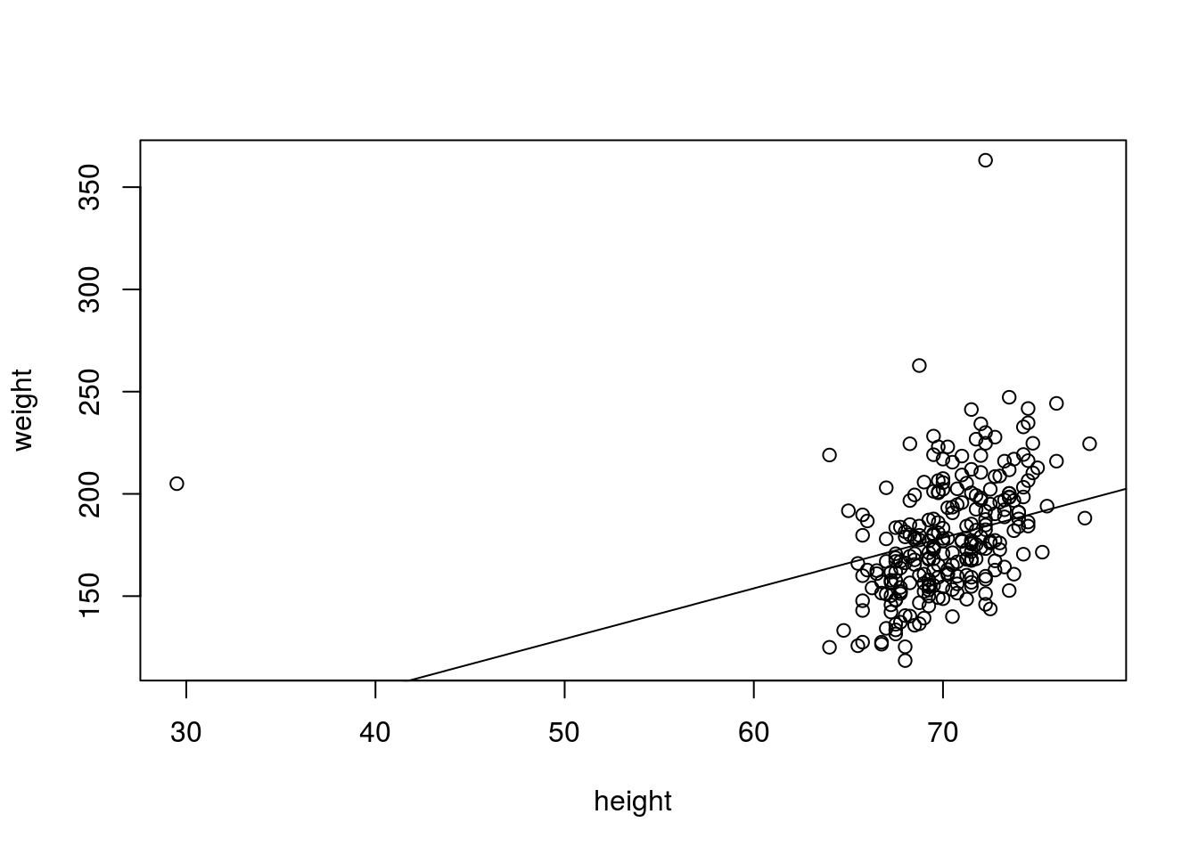
# Least-squares regression is sensitive to outliers, so let's compute the
# trend line when the outliers are left out
hw_fit2 <- lm(weight ~ height, data = fat, subset = height > 50 & weight < 300)
plot(weight ~ height, data = fat, subset = height > 50 & weight < 300)
abline(hw_fit2, col = "red", lwd = 2)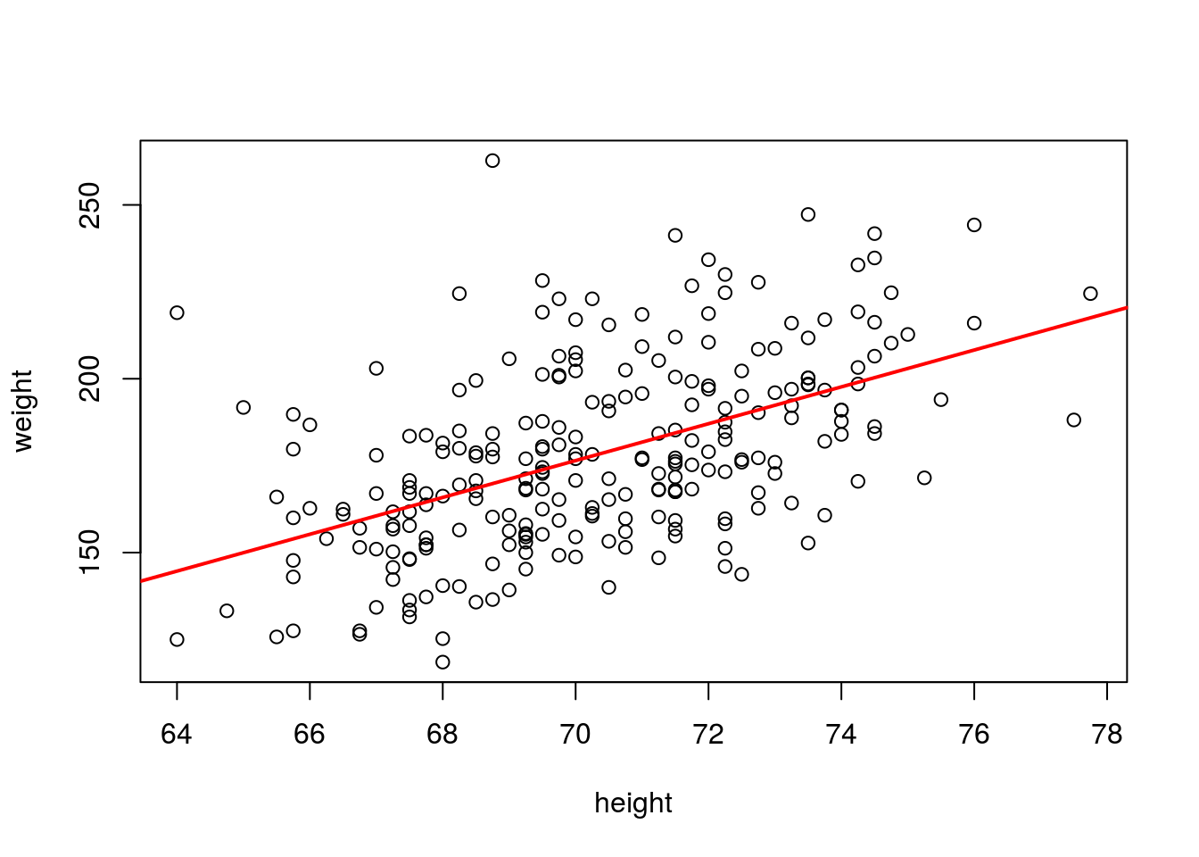
Computation and analysis of trends is a topic discussed much more extensively in MATH 3080, and so I end the discussion here.
Categorical Bivariate Data
So far we have examined only relationships in quantitative data. We can also examine relationships between categorical data.
Numerically we analyze categorical data with tables of counts, with each cell of the table containing a count of the observations having a particular combination of the categorical variables in question. We usually want to consider the joint distribution of the variables in question as well as the margins of the tables. The xtabs() function can allow us to quickly construct join distribution tables using formula notation. xtabs(~ x + y, data = d) will construct a table depending on variables x and y, with data stored in d. One could extend this table to as many variables as desired; for example, xtabs(~ x + y + z, data = d) constructs a three-dimensional array examining the relationship between variables x, y, and z. When creating such an array, you may want to use the ftable() function for viewing the information in the table in a more legible format. For example, if we saved the results of the earlier xtabs() output in a variable tab, ftable(tab, row.vars = 2, col.vars = c(1, 3)) will create a table where the variable associated with dimension 2 (y) will be shown in rows, and the variables associated with dimensions 1 and 3 (x and z) are shown in the columns.
I demonstrate constructing tables this way below, exploring the Cars93 (MASS) data set.
# Two-way table exploring origin and type
tab1 <- xtabs(~Origin + Type, data = Cars93)
tab1
## Type
## Origin Compact Large Midsize Small Sporty Van
## USA 7 11 10 7 8 5
## non-USA 9 0 12 14 6 4# A three-way table
tab2 <- xtabs(~Origin + Type + Cylinders, data = Cars93)
# The following output is hard to parse
tab2## , , Cylinders = 3
##
## Type
## Origin Compact Large Midsize Small Sporty Van
## USA 0 0 0 0 0 0
## non-USA 0 0 0 3 0 0
##
## , , Cylinders = 4
##
## Type
## Origin Compact Large Midsize Small Sporty Van
## USA 7 0 4 7 4 0
## non-USA 8 0 3 11 4 1
##
## , , Cylinders = 5
##
## Type
## Origin Compact Large Midsize Small Sporty Van
## USA 0 0 0 0 0 0
## non-USA 0 0 1 0 0 1
##
## , , Cylinders = 6
##
## Type
## Origin Compact Large Midsize Small Sporty Van
## USA 0 7 5 0 3 5
## non-USA 1 0 7 0 1 2
##
## , , Cylinders = 8
##
## Type
## Origin Compact Large Midsize Small Sporty Van
## USA 0 4 1 0 1 0
## non-USA 0 0 1 0 0 0
##
## , , Cylinders = rotary
##
## Type
## Origin Compact Large Midsize Small Sporty Van
## USA 0 0 0 0 0 0
## non-USA 0 0 0 0 1 0# This is easier to read
ftable(tab2, row.vars = 2, col.vars = c(1, 3))## Origin USA non-USA
## Cylinders 3 4 5 6 8 rotary 3 4 5 6 8 rotary
## Type
## Compact 0 7 0 0 0 0 0 8 0 1 0 0
## Large 0 0 0 7 4 0 0 0 0 0 0 0
## Midsize 0 4 0 5 1 0 0 3 1 7 1 0
## Small 0 7 0 0 0 0 3 11 0 0 0 0
## Sporty 0 4 0 3 1 0 0 4 0 1 0 1
## Van 0 0 0 5 0 0 0 1 1 2 0 0# A four-way table
tab3 <- xtabs(~Origin + Type + Cylinders + Man.trans.avail, data = Cars93)
ftable(tab3, row.vars = c(2, 4), col.vars = c(1, 3))## Origin USA non-USA
## Cylinders 3 4 5 6 8 rotary 3 4 5 6 8 rotary
## Type Man.trans.avail
## Compact No 0 2 0 0 0 0 0 0 0 0 0 0
## Yes 0 5 0 0 0 0 0 8 0 1 0 0
## Large No 0 0 0 7 4 0 0 0 0 0 0 0
## Yes 0 0 0 0 0 0 0 0 0 0 0 0
## Midsize No 0 4 0 4 1 0 0 0 0 3 1 0
## Yes 0 0 0 1 0 0 0 3 1 4 0 0
## Small No 0 0 0 0 0 0 0 0 0 0 0 0
## Yes 0 7 0 0 0 0 3 11 0 0 0 0
## Sporty No 0 0 0 0 0 0 0 0 0 0 0 0
## Yes 0 4 0 3 1 0 0 4 0 1 0 1
## Van No 0 0 0 4 0 0 0 0 0 2 0 0
## Yes 0 0 0 1 0 0 0 1 1 0 0 0When faced with a table, one often wishesw to know the marginal distributions, which is the distribution of just one of the variables without any knowledge of any other variables. We can obtain the margins of the tables produced by xtabs() with margin.table(). The call margin.table(tbl, margin = i) will find the marginal distribution of tbl for margin i, which may be 1 or 2 for a two-way table (corresponding to rows and columns, respectively), but could be higher for more complex tables. I demonstrate margin.table() below:
margin.table(tab3, margin = 1)## Origin
## USA non-USA
## 48 45margin.table(tab3, margin = 2)## Type
## Compact Large Midsize Small Sporty Van
## 16 11 22 21 14 9margin.table(tab3, margin = 3)## Cylinders
## 3 4 5 6 8 rotary
## 3 49 2 31 7 1We have a few options for visualizing data in a two-way table (tables with more dimensions would be more complex and more demanding from visualization techniques). One way would be with a stacked bar plot, where the height of the bar corresponds to the marginal distribution of one variable and sub-bars denote the breakdown for the second category. Better though would be side-by-side bar plots, which don’t stack the breakdown categories one atop the other but instead place them side by side yet in close proxomity. barplot() can create such plots.
barplot(tab1)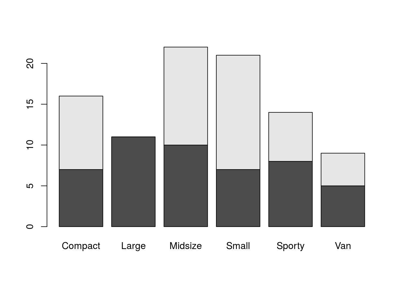
barplot(tab1, beside = TRUE)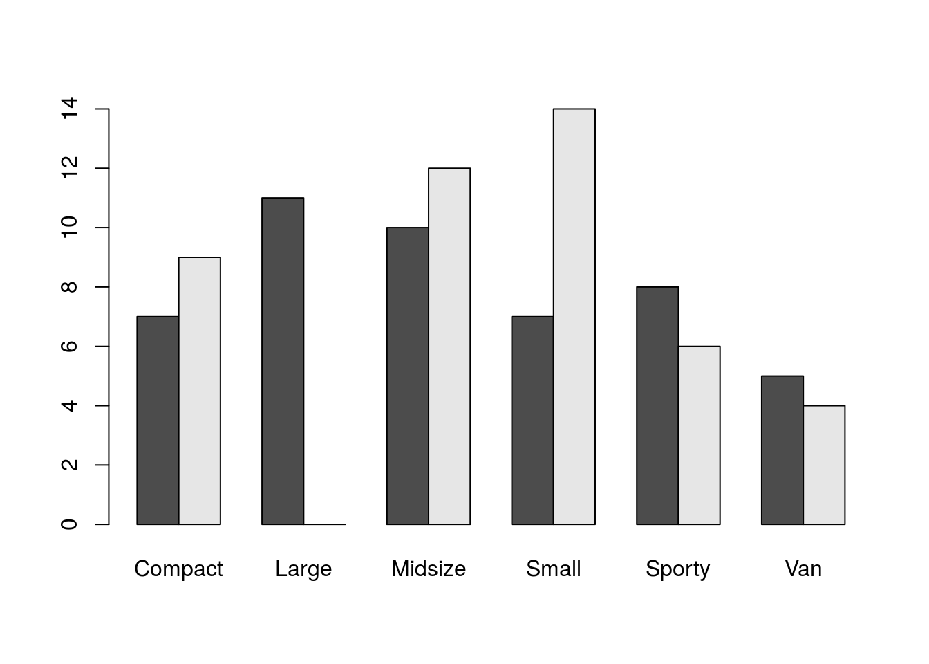
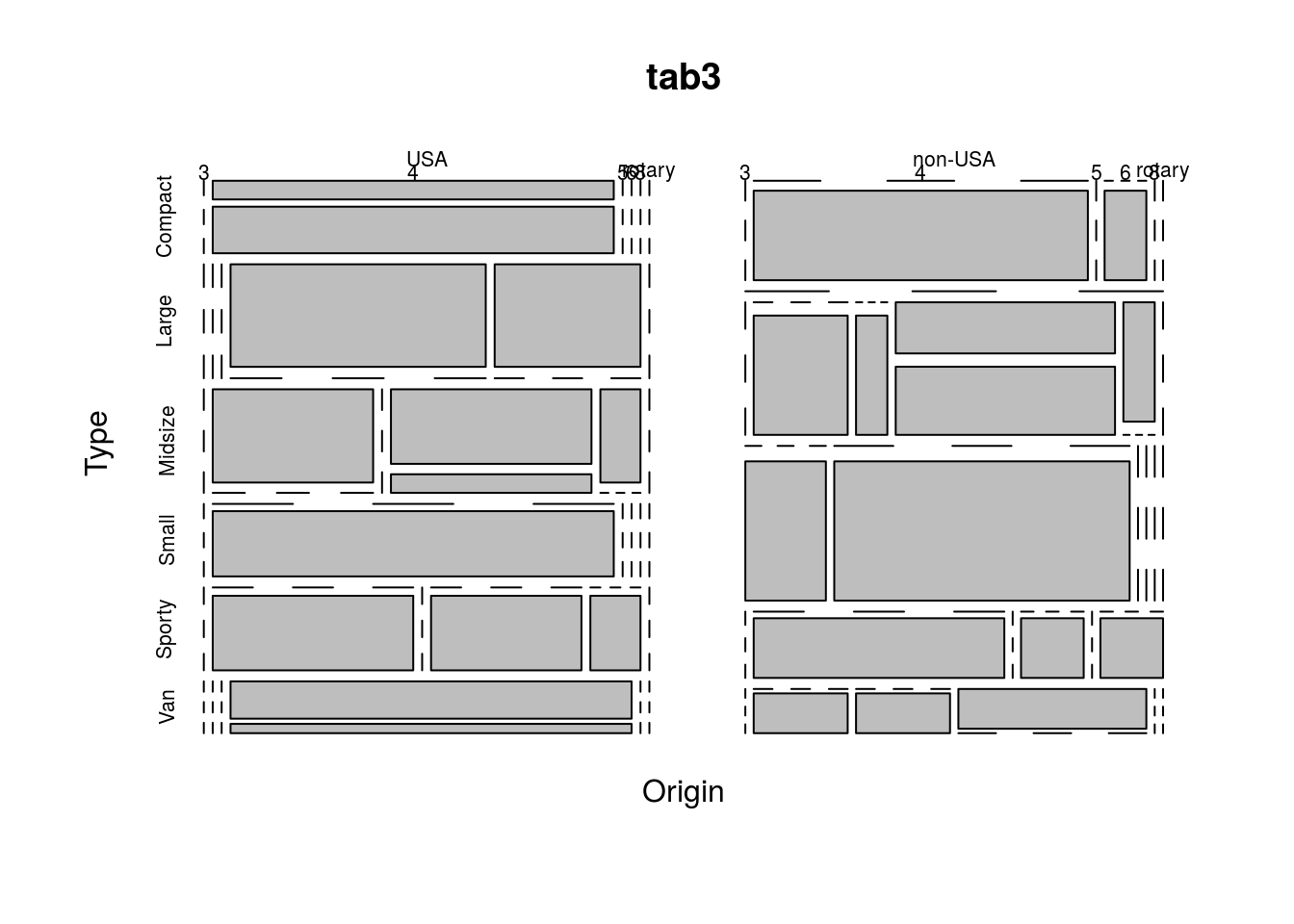
Another option is a mosaic plot, which shows the frequency of each combination of variables as the size of rectangles. This can be created in R using the function mosaicplot(), as below.
mosaicplot(tab1)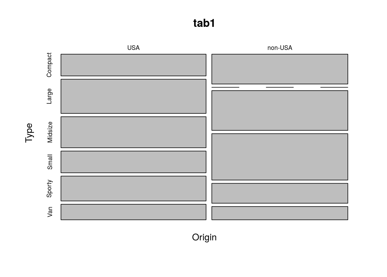
mosaicplot(tab2)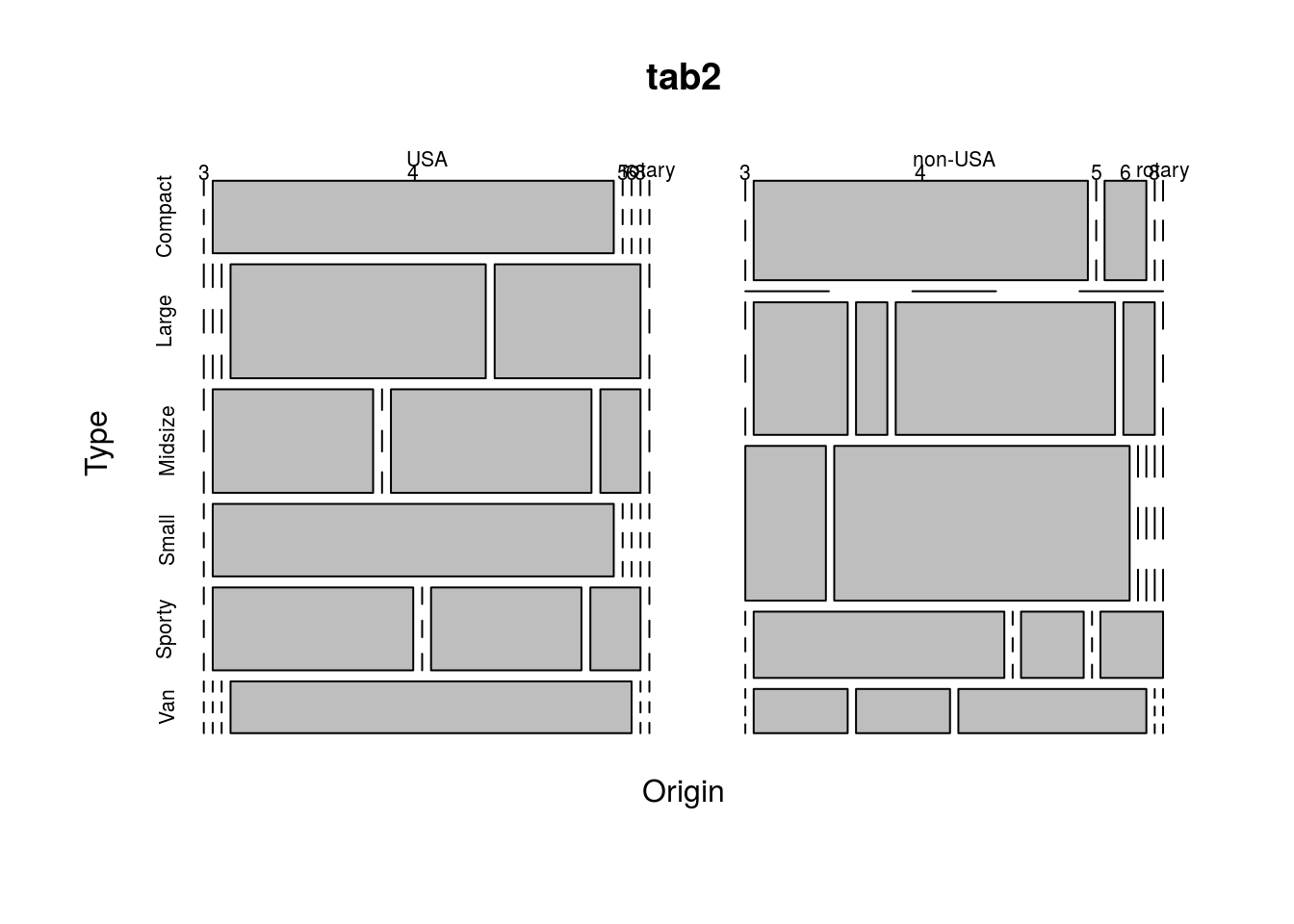
mosaicplot(tab3)